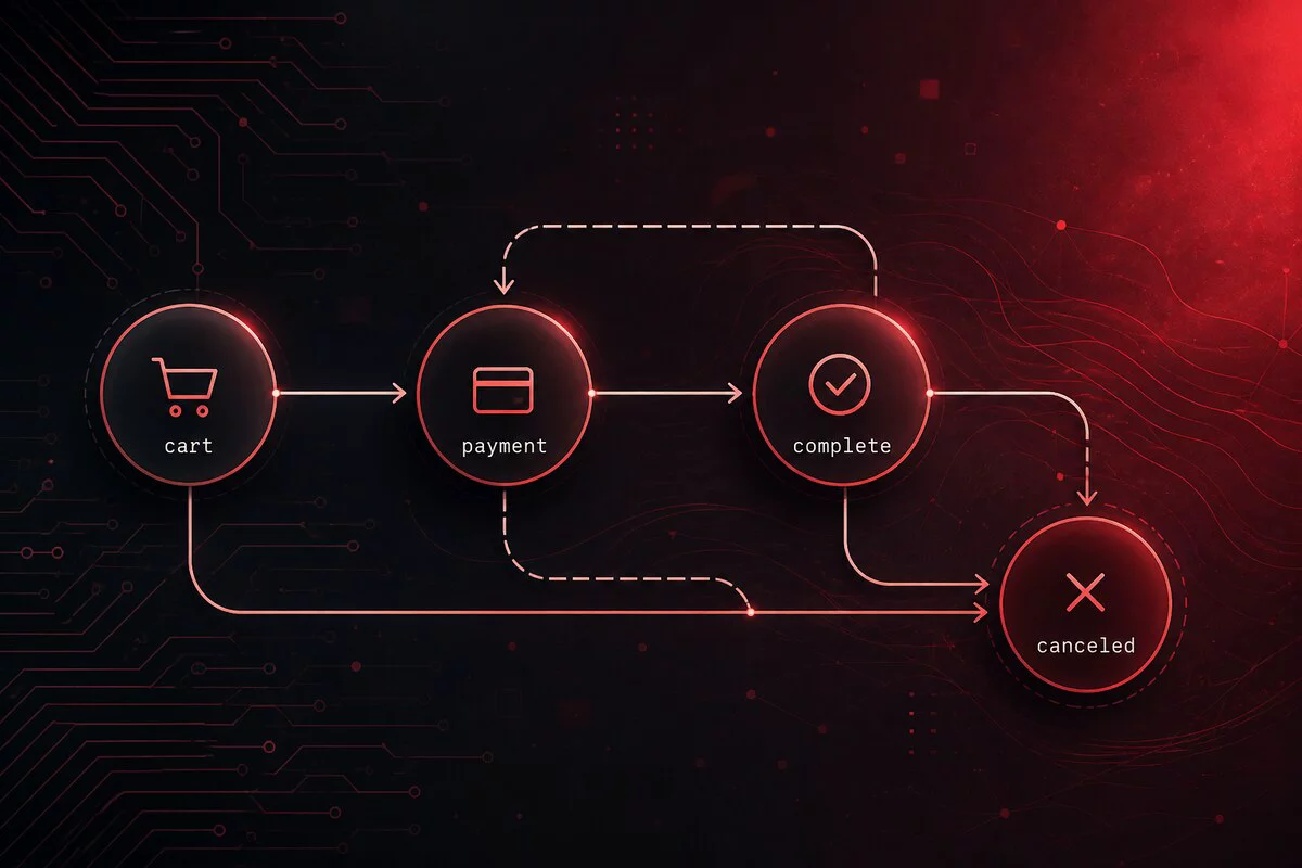
A review system: trust, UI, and features
Not long ago I was designing a review system, and the core idea was this: the site should become more trustworthy because of words from real people. Not because of a pretty description from a copywriter. Because of user content - what someone wrote after they had already bought, eaten, hired, or tried.
Reviews look like a two-day job: a table, stars, a form. That is what I thought until I sat down to design them for real. Almost all of the complexity sits in three places: who is allowed to write at all, how the card looks on screen, and who decides that the text can be shown to people.
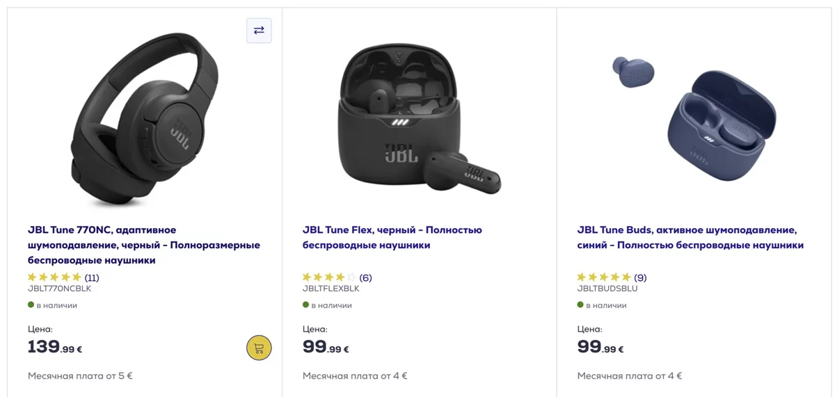
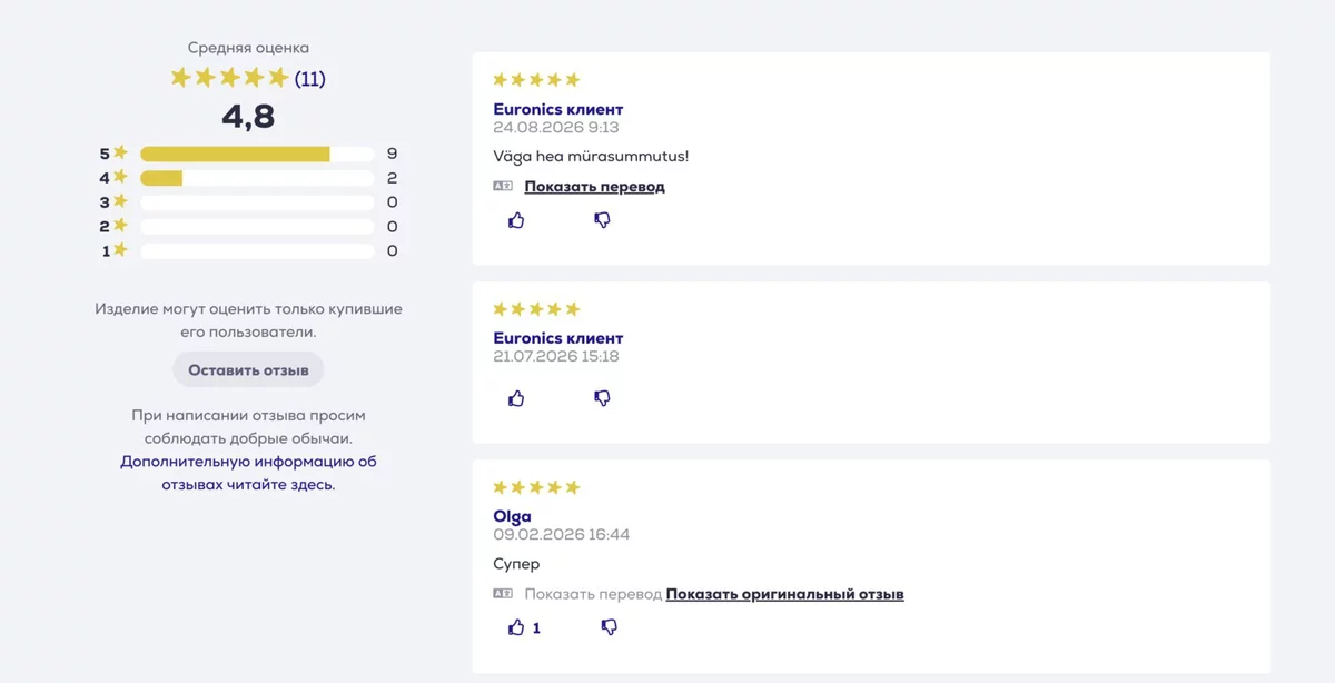
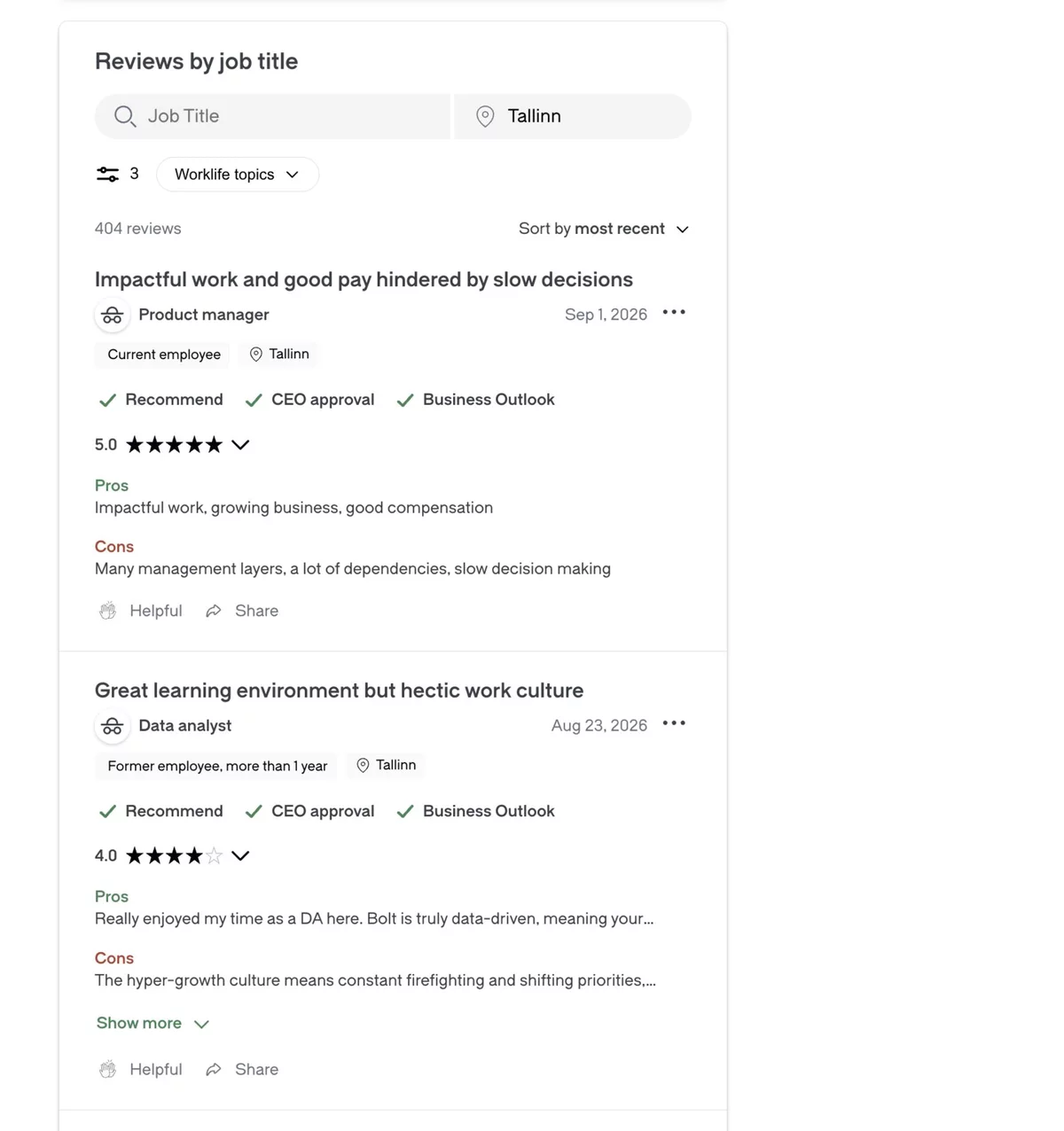
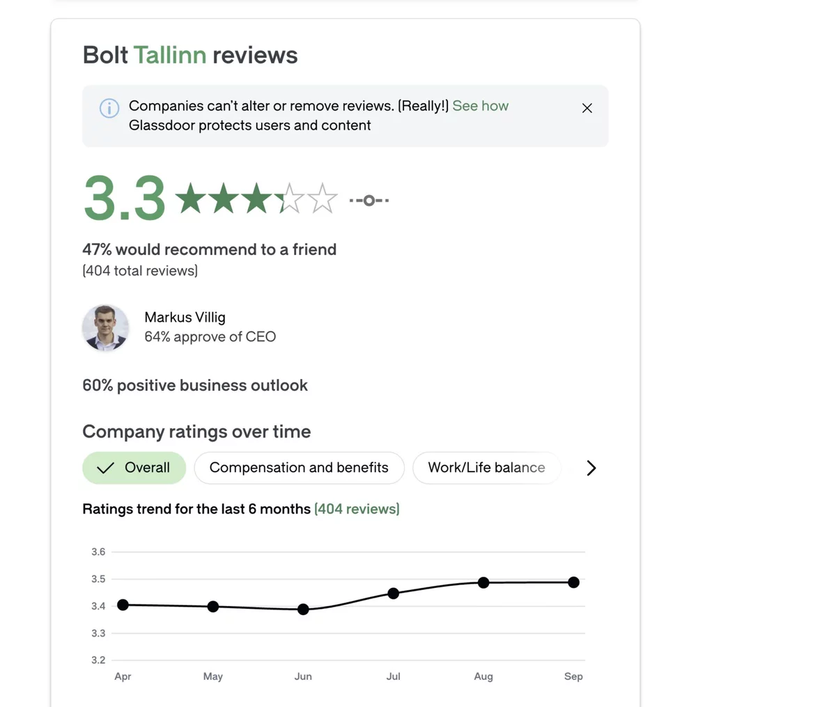
Below is an engineering walkthrough. I am writing it so it reads as being about any review system: products in a shop, restaurants, couriers, contractors, employees. The words change, the structure does not. Along the way I will compare other people's screens: Euronics (a product), Amazon (a huge catalog), Airbnb (a stay), Glassdoor (an employer), and Google (search results). The object is different; the list of questions is almost the same.
Why this matters for the business (and why it shapes the schema)
Three goals. Each one has an emotion for the buyer and a hard requirement for the database.
Trust
A person buys from a stranger if they can see other people's experience. So a review must point at a real purchase, booking, or shift - not at "an anonymous person from the internet".
Search
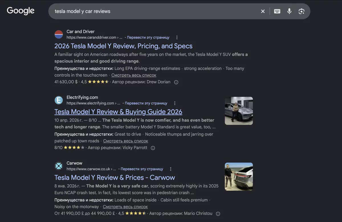
Stars in Google results are a free click. The search engine does not take a picture; it takes two numbers: the average rating and how many reviews there are. Those numbers have to be cheap to compute on every card.
Fewer returns
"Assembled it in an hour" or "the portion was cold" describes the object more precisely than the manufacturer's card. So the text matters more than bare stars, and the text has to be checked by a human.
Trust needs proof. Search needs an aggregate (average + count). Fewer returns need live text and moderation.
The obvious rule: you cannot write a review out of thin air
The cheapest decision, and the one that cuts off 90% of future problems: a review is created only from a confirmed fact. A paid order. A completed booking. A closed shift. An accepted project.
The cost is real too: there will be few reviews. There is no public "leave a review" button for anyone who walks by. Only people who already interacted can write. That is a trade of volume for trust, and it has to be agreed with the business before you start.
Data schema
Which table the review lives in, and which other tables it must point at. The basic version is a reviews table, a translations table, and two numbers on the object being reviewed.
Two ideas without which the schema falls apart.
Two levels of object. There is a concrete experience (I bought a 💻 MacBook Pro 14" with 512 GB) and there is an entity that accumulates reputation (the 💻 MacBook Pro 14" in general). In a shop that is a SKU and a product card. In a restaurant - 🍝 a dish and the venue. For a contractor - a specific job and a person. If you collapse the levels, you either lose precision ("which salad was this review about?") or you never accumulate statistics.
Authorship on email, not on an account. A guest places an order without registering. There is no account; there is always an email. If you hang the review on user_id, half of the people simply cannot write.
| Field | Why a newcomer needs it |
|---|---|
| order_id | Proof. From the order we take the name, country, and the "verified purchase" badge. |
| item_id | What the experience was actually about. Not an abstract product card. |
| product_id | A copied link to the product card, so we can show the review on every variant and compute the average without an extra join. |
| rating | An integer 1..5. Half-stars are a picture of the average; a person sets a whole star. |
| body | May be empty. A rating without text is still a full vote. It does not need moderation or translation, so people finish the form more often. |
| source_lang | Language of the original. Needed so we do not show a translate button when the storefront is already in that language, and so we do not write a second copy of the text into the translations table. |
| state | Not a "published" checkbox, but the room the review currently lives in. Why - the next section. |
| review_translations | Separate rows, not body_et / body_en columns. Key (review_id, locale). The original does not go here: it already lives in reviews.body. The rating is not translated. |
The average and the count sit right on the product. Computing them on the fly for one page is fine. On a storefront of 48 cards it is already expensive for two numbers that change once a week. We recompute when a review is published, hidden, edited, or deleted.
State is a graph, not a flag
The temptation is strong: a "published: yes/no" column. By week two, questions appear that a flag cannot answer. Was the review rejected for good, or is it waiting for a decision? Can the author edit published text? Where does the text go after an edit?
So state is a map of rooms and doors. The room says where the review is now. The door says who is allowed to move it to another room.
Two non-obvious transitions that make a flag insufficient.
Editing published text sends the review back to held. Otherwise moderation is bypassed in two steps: write something harmless, wait for approval, rewrite it into anything. Changing only the stars does not change state - there is nothing to check in a number.
A review without text is published immediately. Human review is needed where there is free text. A rating is a vote, not a statement.
Try the transitions yourself
pending ("accepted, automation is still thinking"). While there is no automation, nobody is ever in that state. A dead state on the list costs more than a migration that adds it later.
How it looks on screen
The schema answers "what can we store". The screen answers "what can a person understand in three seconds". For reviews that matters more than it seems: a buyer does not read documentation, they scan the block with their eyes.
Three widths - three layouts
The same set of data. Three different ways to lay it out, because the eye works differently on a phone, a tablet, and a monitor.
Switch the width
The risotto arrived hot, the mushrooms were excellent. Just right for two.
✓ verified purchaseOn a narrow screen a left-hand star column eats the width of the text. So the stars sit on one row at the top, the summary is centered, and the text takes the full width.
The risotto arrived hot, the mushrooms were excellent. Just right for two.
The drill holds torque, but the case arrived cracked. They replaced it; I lost the weekend.
At medium width a star column appears on the left. The eye runs down the edge like a ruler: fives and ones are obvious without reading every text.
The risotto arrived hot, the mushrooms were excellent. Just right for two.
✓ purchaseThe drill holds torque, but the case arrived cracked.
✓ purchaseOn a monitor the summary sticks on the left (like a table of contents), and cards sit two-up on the right. A full-width long feed turns short reviews into empty stripes.
In the catalog the stars sit right under the title, before the description. If there are no reviews, there are no grey stars and no "0.0" either. The row is simply missing. Otherwise the storefront looks like a graveyard of empty ratings.
Order inside the card - by importance
People scan, they do not read. So the most important thing has to sit higher.
Anatomy of the card
Long text is cut at about five lines. A click expands it. Otherwise one wall of text breaks the card grid on a monitor.
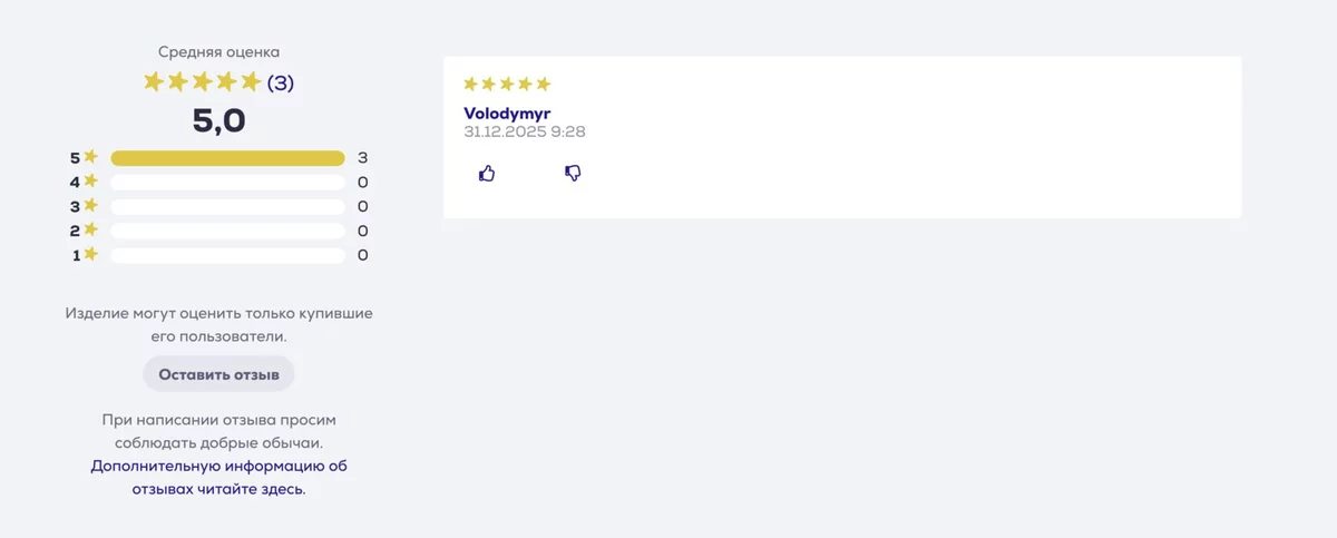
Histogram: why five bars if you already have 4.6
The average is one number. It lies. A product with a single five and a product with twenty threes and fives can produce a similar average. The bars show the shape of the distribution.
People intuitively expect a "J-curve": many fives, a few fours, almost no ones. If the bars are flat or inverted, an average of 4.6 no longer reassures. A doubtful buyer will look for the negative anyway. The only question is whether they find it on your site in one click, or leave for another site.
Click a distribution row. The 4.6 summary does not change
Zero bars are not clickable: an empty list looks like a broken site. At five reviews, filters only add noise. A sensible threshold for showing the block is around ten.
Sorting
Three modes you actually need from day one. Each answers a different reader question.
| Sort | Reader question | Why not always the default |
|---|---|---|
| Newest first | "What are people saying now?" | A good default. Freshness matters more than a perfect order. |
| Critical first | "Where is the catch?" | A perfect rating looks suspicious. One click to the ones raises trust in the whole block. |
| With text first | "I want experience, not a vote" | A rating without text is useful for the average, but in the list it is an empty card. Better not to hide it, just push it down. |
A "most helpful first" sort appears only together with a Helpful button. A catalog filter by stars is a separate feature too, and it is no longer the review list on a card: it is the search results themselves.
Catalog filter by stars
On a product card a person clicks a bar to see the ones. In the catalog they want something else: "show products rated 4 stars and up" or "highest rated first". Those are different filters. One cuts reviews inside one object. The other cuts the objects themselves in a long result list.
The stars already sit on the product card. The question is not "where do we get the number", but "how do we search by it quickly" and "what do we do with thousands of items that have no reviews".
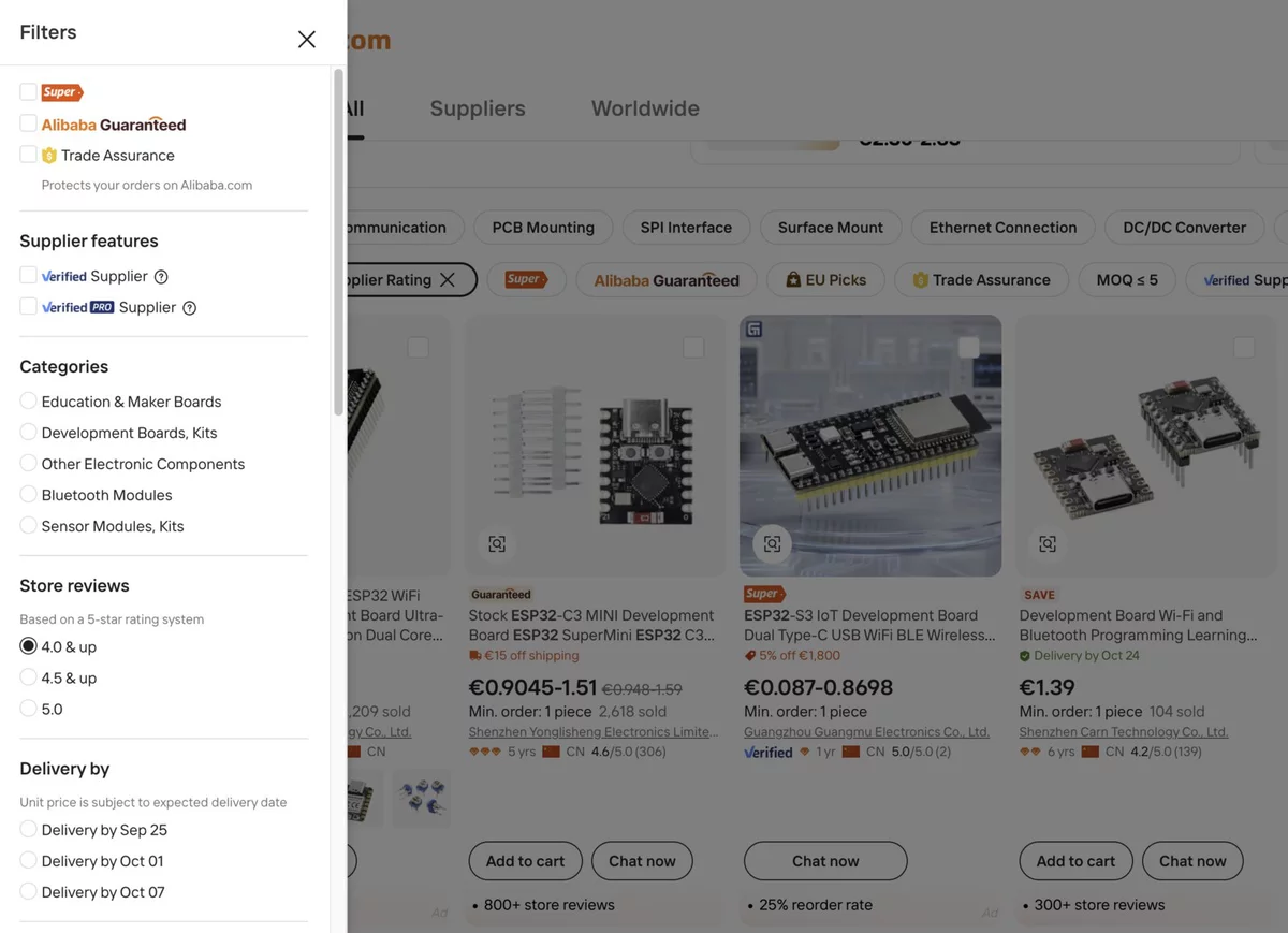
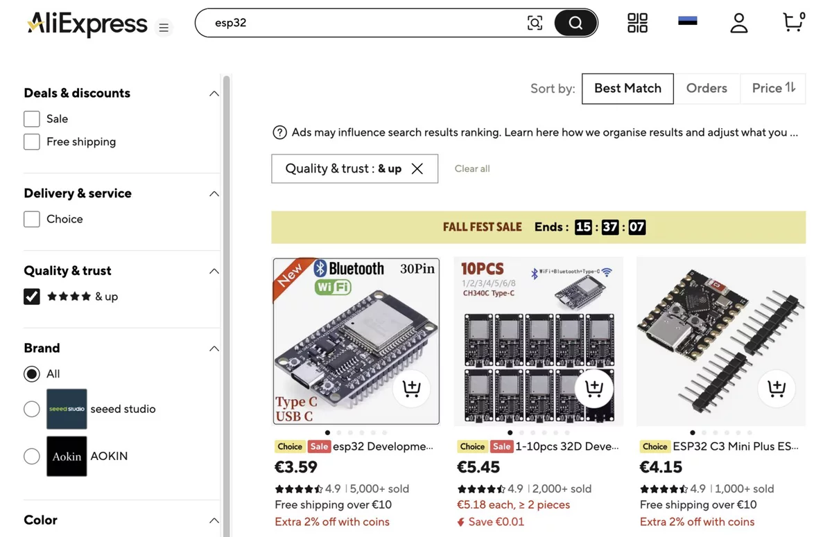
What actually goes in the sidebar
- 4.0 and up
- 4.5 and up
- exactly 5.0
- has reviews
- exactly 2 stars
- exactly 3 stars
- The 1-5 bars on a product card are for reading the negatives. In the catalog that is a different question.
The cost of a separate feature. The rating has to go into the search index, and every Approve or Reject will start reindexing the product. Items with no reviews: send them to the end, hide them at a threshold, or add a separate "has reviews" chip. The small-sample trap: one five will beat a 4.6 from 23 reviews unless "Highest rated" is corrected with a minimum N or a Bayesian average.
Load more, not a wall of text
On a phone, start with 3 reviews. On a monitor you can open more. A "more" button loads the next batch without reloading the page. You can start loading the next batch in advance, while the person is still reading the first - then the click feels instant.
Why: a product page is heavy even without reviews. A hundred reviews at once will slow both the first paint and the search markup (only reviews that are actually rendered go into it).
Relative time
We write "2 months ago" and hide the exact date in a hover tooltip. People compare the experience with "now", not with a calendar. A 2019 review of a 2024 model reads differently from "2 months ago".
The "verified purchase" badge
This is not decoration. It is the schema invariant translated into human language. If a review cannot be created without an order, we have the right to say that out loud. Without the badge the block looks like ordinary comments that anyone could have faked.
Name, country, and why there are no flags
Publicly: first name plus the first letter of the last name ("James S."), country in words, date. Not the full name, not the city, not the email.
I deliberately do not put a country flag. Three reasons:
- In a small country, a name + a rare order + a flag already identifies the person. GDPR asks you to minimize.
- A flag reads as politics, not as "where the order came from".
- The word "Estonia" is clear to a screen reader and in black-and-white print. A flag icon is not.
We do not show the city for the same minimization reason. The country is enough to understand the context ("do people from my market write here").
One review, several models. The MacBook analogy
Imagine Apple. MacBook Pro 14" is the product card. Space Gray 512 GB and Silver 1 TB are variants. The person bought 512 GB. Their experience is almost entirely about the same laptop: screen, keyboard, heat. But battery and weight are already different.
So the review is written against the purchased variant, and shown on every variant of the same card. And it must be marked: "this is about 512 GB" if you are currently looking at the 1 TB page.
The same review on two pages
Quiet, the screen is excellent. By evening the battery lasts just about a workday.
✓ verified purchase ✓ this exact model · 512 GBQuiet, the screen is excellent. By evening the battery lasts just about a workday.
✓ verified purchase a different model was ordered · 512 GB →The same in a restaurant: a review of "Caesar with chicken" is visible on the "Caesar with shrimp" page, but the badge says "this person ordered chicken". For a worker: a review of a bathroom renovation is visible on the profile, but marked as "bathroom, not kitchen". The aggregate (average for the card) is counted across all variants together. Otherwise each SKU would have one review, and the statistics would never add up.
How to get people to write reviews at all
The form can be perfect. Without an email after delivery almost nobody will open it. People do not wake up wanting to write a review. They need a reminder at the moment when the experience already exists, but has not been forgotten yet. When the order becomes delivered, the order service schedules one durable job for roughly 14 days later; a worker sends the invitation when that job is due.
The first email
Hi Mari,
Order #R123456789 arrived two weeks ago. How is the drill? Your rating helps other people choose.
Do not want these emails? Unsubscribe
Important details. The email does not ask for five stars, it asks for experience. Unsubscribing is a separate confirmation, not a link that silently changes a setting via GET (mail robots open those on their own). The form lives on a separate page: the order line has room only for a button.
The form and moderation
Without this block, reviews do not live: a person has to be able to write, and a person from support has to decide the fate of the text.
How a person reaches the form
Three short sequences instead of one large diagram: first the system sends an invitation, then the buyer reaches the form from the email or product page, and finally a moderator releases the text for other visitors.
The invitation email
From the email or product page to the form
There is no public "for everyone" button. The link from the email does not create a review: it only opens the order. The form lives on a separate page - the order line has room only for a button.
Approve — publication for everyone else
The form
There is one required field: the stars. Text is optional.
A queue plus an email
The admin UI is a place people visit when they are already sitting at a computer. A review arrives at any time. So every text review in held sends an email to support, and the queue remains the source of truth.
The order number in the email subject pays for itself immediately: helpdesk attaches the thread to the purchase on its own. The admin does not edit the text. Only Approve or Reject. The moment a moderator rewrites someone else's words, reviews stop being reviews.
Markup for search engines
A search engine reads more than what a person sees. schema.org has two types for this inside a product card:
- AggregateRating - the average and the review count. This is where the stars in search results come from.
- Review - one visible review: author, date, rating, text.
A separate JSON-LD is not needed if the page already has a Product: both blocks nest inside it. In short it looks like this:
<article itemscope itemtype="https://schema.org/Product">
  <h1 itemprop="name">18V drill/driver</h1>

  <div itemprop="aggregateRating" itemscope
       itemtype="https://schema.org/AggregateRating">
    <span itemprop="ratingValue">4.6</span>
    <span itemprop="reviewCount">23</span>
  </div>

  <article itemprop="review" itemscope
           itemtype="https://schema.org/Review">
    <span itemprop="author">James S.</span>
    <time itemprop="datePublished">2026-07-02</time>
    <span itemprop="reviewRating" itemscope
          itemtype="https://schema.org/Rating">
      <span itemprop="ratingValue">5</span>
    </span>
    <p itemprop="reviewBody">Holds torque evenly.</p>
  </article>
</article>
Only published reviews that are actually rendered go into the markup. So a "1 star" filter cannot be a page URL change: otherwise Google would see an average of 4.6 plus only the bad texts. The filter lives inside a page fragment and does not touch the canonical address.
Automatic translation and auto-flagging
People write in their own language. On a foreign storefront that review is noise. Manual moderation does not scale: a human reads every text to catch rare spam and a phone number in a paragraph.
One model solves both jobs in one call. It reads the original anyway to understand the language. In the same pass it checks the text (personal data, spam, off-topic complaint) and prepares translations.
We do not translate "into every language in the world", but into a fixed set of locales the storefront is built for. If the site speaks Estonian, English, Russian, and Finnish - the model writes those rows into review_translations in one pass. The original language is not in the set: it already lives in reviews.body and source_lang.
Another architecture is to translate into the viewer's language on demand and immediately save the result into the same table. The first person with a Japanese Accept-Language waits a second; the next ones read the cache. That is cheaper if there are many locales, or one storefront with a long tail of languages. It is worse if the moderator must ship already-ready text: the translation may appear after Approve, and the original will flash on the storefront for a moment.
| Approach | When it wins | Cost |
|---|---|---|
| Storefront languages in advance | Two to five locales, moderation before publish, instant language switching | We pay for languages nobody will open |
| On demand for the viewer's language | Many locales or an unpredictable Accept-Language | The first viewer waits; the translation may miss Approve |
This is where the pending room appears: "accepted, automation is thinking". Now someone is actually in it - for a few seconds.
On screen there is always one text, as at Airbnb. The button does not open a second block, it replaces the paragraph. If the review language matches the storefront language, there is no button.
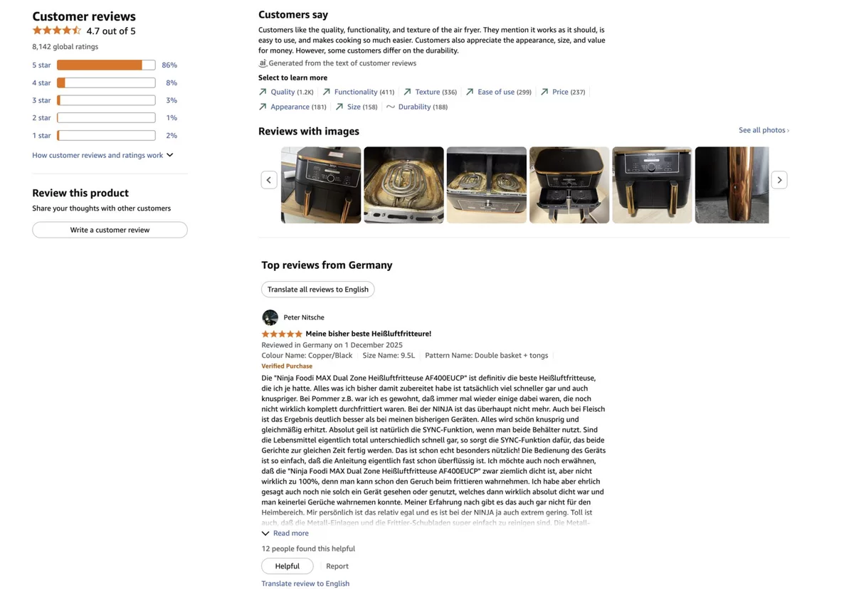
Amazon, on a huge catalog, takes the second path even further: the original stays on screen, the translation is not swapped in by itself. On an English storefront a German review stays German, and "Translate review to English" loads the translation on click. That is cheaper when there are many languages. And the click itself is a signal: the person read far enough into a foreign text to want to understand it. That request can go into the same bucket as "Helpful" - the review was valuable enough to cross a language barrier.
Translation toggle
The risotto arrived hot, the mushrooms were excellent. Just right for two.
Why a single 1-5 scale is not enough
"Four stars" is not meaning. It is compression. One person said that because the risotto was excellent and they waited a long time. Another - because the drill is average, but it arrived fast. A third rated the waiter, not the dish. The reader cannot see any of that.
A flat scale works well as a vote and as a number for Google. As an explanation of experience - badly. That is why on screen the text sits above the author, and the histogram matters more than the average: they at least show the spread.
Several axes help - and still constrain
The next temptation: ask for six stars instead of one. In a restaurant - taste, portion, wait, price, service, atmosphere. For a tool - torque, comfort, battery, noise, case, price. On screen that becomes a radar. The buyer sees not "4.3", but "food is excellent, wait was long".
A plus for the company: a systematically low "wait" is a complaint about the shift, not the kitchen. Axes are filled with clicks; they do not need translation or moderation.
The cost: six questions instead of one kill reviews that are already rare. Google still takes one number. If the axes are optional, one will have 3 votes and another 20 - the radar starts lying, and you have to hide an axis until a threshold.

Axes are useful as a catalog of topics. They do not replace a live story. A person will still write what you did not anticipate: "the bits in the kit are fine, but the latch on the case still would not open on the first try". A scale will not catch that.
AI reviews as an answer to both limits
People write badly into an empty field. You get "great" or a complaint about delivery. Several axes fix that only partly, at the cost of friction. A stronger move is a short dialogue.
A dialogue instead of an empty field
The bot assembles a draft. The person edits and confirms. They still set the stars themselves. They can close the chat and leave only a rating. Then the usual path: text into held, a human Approve.
When there are many reviews, a second AI layer is a "what they praise / what they complain about" summary above the list. Not a replacement for reviews, a table of contents. The threshold is about 20 texts: on five reviews one loud minus looks like everyone's opinion.
- Even torque, bits do not strip
- Honest portions, fresh mushrooms
- The case latch is stiff
- Waited forty minutes
Risks: the same "shop voice", a legal note "assembled with an assistant", hallucinations in the summary. The stars remain a fact from the database. If the model is wrong, the average is still honest.
Author context
For a restaurant the main question is the occasion: a business lunch and a birthday read differently. For a tool - the job: assembled a shelf or drove a frame. For a contractor - the type of object. "It fit perfectly" is useless if the author had a different context.
The data is often already in the order. One column on the review, a filter by family, not by exact match: otherwise the filter is always empty. An exact address and a license plate never go into the public block.
The "for my car" filter, and the same pattern elsewhere
Some businesses sell a part that has to fit something the buyer already owns. The main question is not "is this a good thing", but "will it fit mine". A review that says "it fit perfectly" is useless if the author had a different host.
Spare parts are the cleanest example. A person is not looking for brake pads "in general", they are looking for pads for their Octavia. They already picked the car in the fitment selector; it sits on the order. The form should not ask them to type it: we prefill it from the order and let them confirm or clear it. We store the catalog name, not free text. A license plate is never shown.
Three degrees of match, not yes or no
Fitted in about an hour, no modifications. Bite is much better than the cheap set I had before.
✓ verified purchase Škoda Octavia III 1.6 TDI · 2014Went on without any trouble, though the pedal feels softer than the originals.
✓ verified purchase Škoda Octavia III 2.0 TSI · 2017Good pads for the money. They dust the wheels more than I expected in the first weeks.
✓ verified purchaseAn exact "same engine as mine" filter is almost always empty at the start. Cut by model family, and print the variant on the badge: the reader can see that the author has a 1.6 TDI and they have a 2.0 TSI.
The same pattern lives far beyond car parts. Anywhere a SKU fits a catalog of hosts the buyer already owns, a review has to be read through that filter.
| Business | What the buyer already owns | Exact match | Family we filter by |
|---|---|---|---|
| Auto parts | The car in the garage | A specific engine and years | Model: Octavia III |
| Cases and glass | The phone | iPhone 16 Pro | iPhone 16 |
| Cartridges | The printer | HP LaserJet Pro M404dn | M404 series |
| Lenses and batteries | The camera | Sony A7 IV | Sony E mount |
| Bike parts | Frame and groupset | Size 56 / Ultegra | Road bike |
| Watch straps | The watch | A specific model, 20 mm | 20 mm lug width |
| Plugins | The site stack | WordPress 6.6 + Woo | WordPress |
| HVAC filters | The unit | The exact installer SKU | Manufacturer series |
One rule covers all of them. An exact filter is almost always empty. A family gives a useful list. We do not store free text ("for my car", "for my printer"): the compatibility catalog already has the name, and it does not need translation or moderation. If the host on the order is unknown, we do not render the field in the form at all.
The reader's car, phone, or printer is used only for the filter; it is not written into someone else's review. The author may have looked at three hosts and bought a part for a fourth, so the form asks them to confirm instead of silently prefilling.
An update after 6-12 months
After two weeks a person will say "it arrived fast". After a year they know the main thing: it held up or it did not. A competitor who asks on day two will never have that.
The first review and a later edit of the experience
Assembled the kitchen over the weekend. Torque is even, bits do not strip.
On a job site the battery died faster than promised. The case latch stayed stiff. I would buy it again because of the torque.
Technically it is better to have a separate linked row pointing at the parent, not fields inside the same review: the update goes through the same moderation and translation. In the average rating the thread counts as one vote; we take the latest score. Otherwise one person votes twice. That is exactly the kind of decision that is expensive to change after launch.
Photos and video
The most convincing format and the heaviest: file intake, resize, previews, antivirus, image moderation, and for video also transcoding. Plus consent to publish and deleting every copy under GDPR.
If media do appear, they should sit above bare text in the list: the eye catches a photo harder than a date. The object's rating does not change because of list order. Amazon solves this with a strip above the list, not by reshuffling cards: a separate gallery of reviews with photos gives the same media priority, only even earlier, before the first paragraph.
Media reviews first, the photo expands in place
Inside the group - newest first. The rating does not change.
The risotto arrived hot, the mushrooms were excellent. Attaching a photo of the plate and a short video.
✓ verified purchase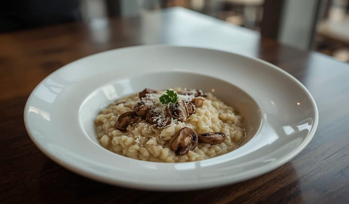

Holds torque evenly. The case is convenient, the latch is stiff.
✓ verified purchaseMarek's review is newer, but it sits second: media outweighs the date.
Why not a modal: the review text stays on screen, and the picture is read together with what the person wrote about it. A separate window breaks reading and breaks Back on a phone.
Helpful and the author hub
Other readers' votes give you a "most helpful first" sort and a reason to write with more substance. The cost: a new votes table and protection against gaming. The "Helpful" label matters more than a like: the person is judging the usefulness of the experience, not agreeing with the stars. The vote does not change the object's rating.
The button on the card and a personal section
The risotto arrived hot, the mushrooms were excellent. Just right for two. If you come as a pair - get a salad too.
✓ verified purchase2 months ago · published
Hot, the mushrooms were excellent. Just right for two.
♡ Helpful · 183 weeks ago · under review
Torque is even, bits are fine. The latch is stiff.
⏳ under reviewOnly a signed-in user can vote, you cannot vote on your own review, one active vote per "person + review" pair. A guest sees the counter, but a click asks for sign-in and does not bump the number in advance. Otherwise one browser becomes hundreds of likes by clearing cookies.
Expert status and careful rewards
Once Helpful is already working, the temptation is to highlight authors whose texts reliably help people choose. A badge next to the name says: this person writes more than once, and people read them. A discount can add motivation. It can also turn reviews into paid endorsements if you tie it to a five-star score.
The public signal and the reward in the account
Fitted without modifications. After 5,000 km there is no vibration, and they make less dust than my previous pads.
✓ verified purchase16 points to expert status
A sample threshold: at least 5 published reviews with substance, 25 helpful votes from different people, and no recent violations.
30 days, once, not stacked with other promo codes. This is an experiment mechanic, not a day-one promise.
A safe launch order. First the author hub: the person sees their reviews and the next step. Then Helpful: check whether people vote at all. Then the badge on a small group: compare usefulness and conversion, not only clicks. The discount is last, a limited A/B, and only after anti-gaming and a discount-economics check. You cannot start with the discount: that is an immediate financial reason to write anything.
Avatars
A live face next to a review makes it look like a person's words, not a row in a database. Three sources by priority, none required: your own photo in the account, Gravatar from an email hash, a letter in a circle as a fallback.
The same slot: a live photo and a fallback letter
The risotto arrived hot, the mushrooms were excellent. Just right for two.
✓ verified purchase
Holds torque evenly, bits do not strip.
✓ verified purchase
Tasty, but we waited forty minutes.
✓ verified purchaseGravatar is a request from the reader's browser to a third party: it sees the email hash and the IP. Without explicit consent and a line in the privacy policy that is not allowed. Coverage in ordinary shops is low, so the main effect comes only from your own upload. You cannot publish a personal photo without moderation: someone else's face, or anything else, will end up on the storefront.
A public reply and brand reputation
A short reply under a negative review takes the sting out for every future reader, not only for one complainant. Technically simple. Organizationally hard: who replies, in what time, in which language, and whether an email goes to the author.
The reply is nested under the review; it is not a second review
The portion arrived lukewarm, the salad went soggy. The risotto itself was fine, but the evening was already ruined.
✓ verified visitSorry about the wait and the lukewarm salad. We changed the shift for this slot and sent you a voucher for a later visit. If anything else is wrong - reply to the order email.
Rules without which a reply hurts: do not reply only to ones, do not argue with the author, do not flash the order number, one reply per review. We take the dialogue into support and leave the outcome in public.
An aggregate across all products of a brand (or all of an employee's shifts) turns a handmade "premium" badge into a provable number. You need protection against a tiny sample: one five should not lift a brand above someone with a thousand honest 4.6s. And you cannot hide weak categories inside a pretty average.
The "how we handle reviews" page
In the EU, if you show reviews, you are probably required to explain: do you check that real buyers left them, and how. The good news: with a "review must point at an order" schema this page is written in ten minutes and sounds convincing. The link is a calm footnote next to the block title, not a "you can trust us" banner.
The footnote by the block, and the page itself
Guest reviews
How we handle reviews →- Only someone who already ordered, ate, or closed a shift can write. There is no public "for everyone" button.
- We do not pay for a review and do not ask for five stars.
- We do not delete negatives. We hide only spam, personal data, and off-topic text.
Privacy: the only irreversible action
A review is a place where a private action becomes public. Two decisions have to be made explicitly.
What to show. First name plus the last-name initial, country in words, a relative date. Everything else from the order stays inside.
What remains after an account is deleted. If reviews disappear with the account, the product's average rating is rewritten after the fact. If they stay, they have to be anonymized. Both options are defensible. You have to choose before launch and write it on the account-deletion screen, not only in the policy.
The deletion screen and the same review after it
Delete account
Your data will be deleted. Published reviews will stay on the site - without a name, only initials and a country.
If you need a specific review taken down, delete it before deleting the account, or write to us.
Sobis autole täpselt, tarne võttis kolm päeva.
✓ verified purchaseuser_id is nulled, the author is anonymized, the text and rating stay. The product rating is not rewritten after the fact. The right to delete a specific review still exists: the author before account deletion, or an admin on request.
What I took away from the design
What I took away for myself is a useful example of a vertical feature that is not obvious from the outside. Reviews look like a table and stars. Inside they are several layers at once, and you have to design them together, not as a pile of tickets.
I had to think through the basics: who is allowed to write, what lives in the schema, which rooms a review occupies. I had to study competitors - not to copy a screen, but to see which questions they had already closed and which they had walked around. I had to design UI/UX for different widths and different states: phone and monitor, a card with text and without, the storefront language and a foreign paragraph, media and a bare rating.
Separately - who buys, and how that person adds a review. There is no public "for everyone" button. The person arrives from an email or from a purchased product page. So the form, the email, and moderation are one feature, not three backlogs.
Then priority. Features go into the queue by weight and importance, not by how pretty they look. The invariant "a review without an order does not exist" is cheap and closes nine tenths of future problems. Photos, Helpful, avatars, and an expert badge are convincing, but each one pulls in its own table, antifraud, and moderation. A contribution discount cannot launch before anti-gaming, and it cannot be tied to a five-star score. A catalog filter by stars and a "for my X" filter look like sidebar checkboxes, but they need an index and a careful family, not an exact match. Those can wait. What is expensive to migrate - a year-later update, and the fate of a review when an account is deleted - has to be decided before launch.
I am not even going into the email details here. Do you mail everyone who ever bought? How do you let people unsubscribe and subscribe again? How do you keep this apart from ordinary transactional mail? Maybe you should not spam everyone, and not write on every purchase. The same for moderation: which rules, what the rejection process looks like, what the author sees when the text is not released. Those are separate products inside the same vertical. For a start, the invariant, three state rooms, and a human who presses Approve or Reject are enough.